


Payment app and brand
clearXchange is an electronic payment network owned by seven of the largest U.S. banks, offering faster and more secure transactions than popular apps like Venmo or Square Cash. However, despite their robust infrastructure, they lacked the seamless, user-friendly mobile experience that their competitors provided.
They approached us to rebrand their business from the ground up and to design a central digital product that would combine their security and speed with an intuitive, delightful user experience.
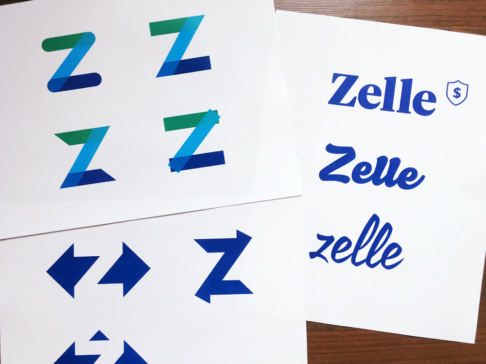
The identity—
We initially focused on attracting existing payment app users by highlighting the speed and simplicity of direct bank transfers. However, as the project evolved, we shifted our focus to the 95% of Americans who had never used their phone to make a payment. This required the brand to be both trustworthy and effortless while standing out in a crowded market.
After an exhaustive legal review of hundreds of potential names, including options like Buckit, Scratch, and Tally, we finally landed on the name Zelle. The name functions well as a verb and avoids the limitations of a traditional dictionary word.
With the name and brief in place, we began developing numerous rough visual concepts to bring the brand to life.

We developed several concepts that emphasized trust, ease, and connection. However, for a new product, we couldn’t overlook the value of a mark that communicated these qualities so clearly. To differentiate Zelle in a crowded market, we intentionally avoided the conventional blue associated with traditional finance and the green commonly used by fintechs.
Instead, we chose a purplish indigo—a color that still conveyed trust but was more distinctive. This shade also carries historical associations with wealth and royalty, adding an additional layer of meaning to the brand.

The core functionality of the product is straightforward, with existing examples to build upon, so our focus was on creating a strong, branded experience. The primary challenge was communicating to users why a small percentage of payments might not go through due to complex business rules, as well as addressing the various exceptions and edge cases.
The minimal landing screen consistently reinforces the product’s simplicity and value proposition. Beyond the standard contact search, the app also highlights contacts you’ve recently paid and detects nearby Zelle users via Bluetooth, even if they’re not in your contacts—making it especially useful for one-time payments, such as in retail stores.
Venmo and Square Cash offer limited bill-splitting features, but we enhanced this by not only calculating the splits for you but also allowing you to adjust individual amounts—perfect for those with friends who tend to indulge a bit more. We also designed the app’s notifications and activity history using a card-based system for a more intuitive experience.
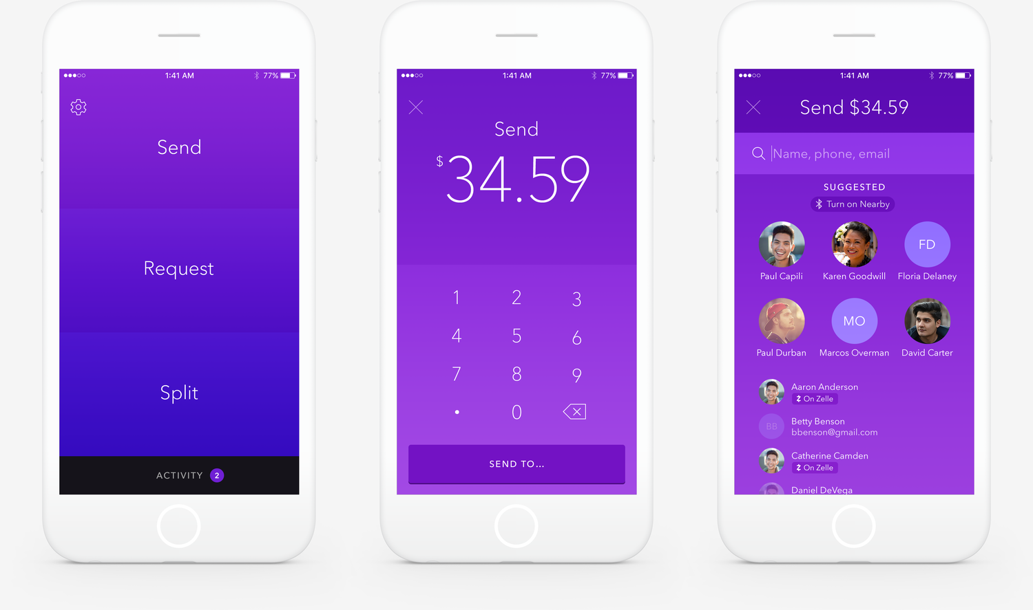
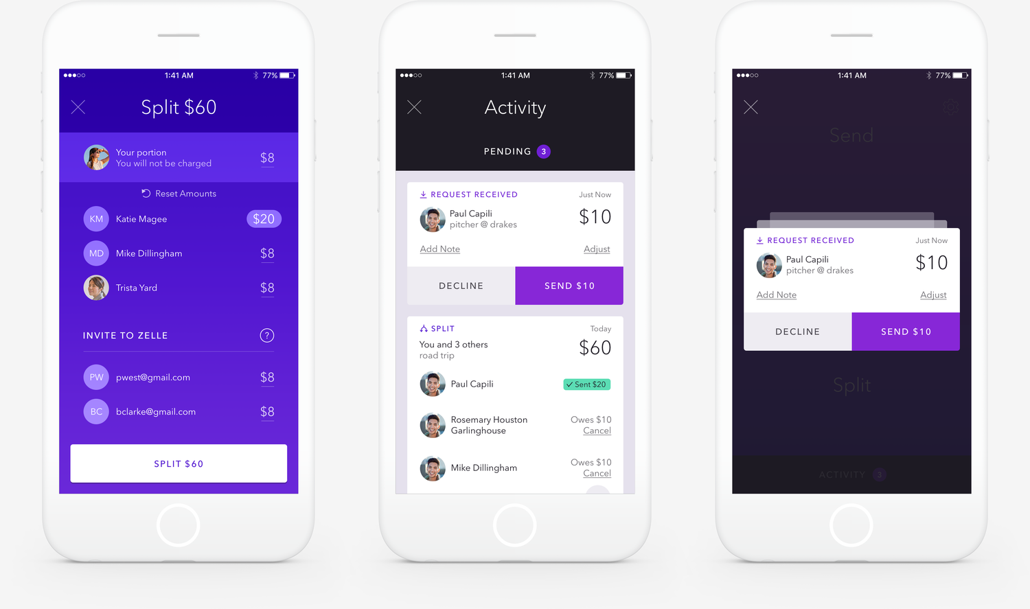
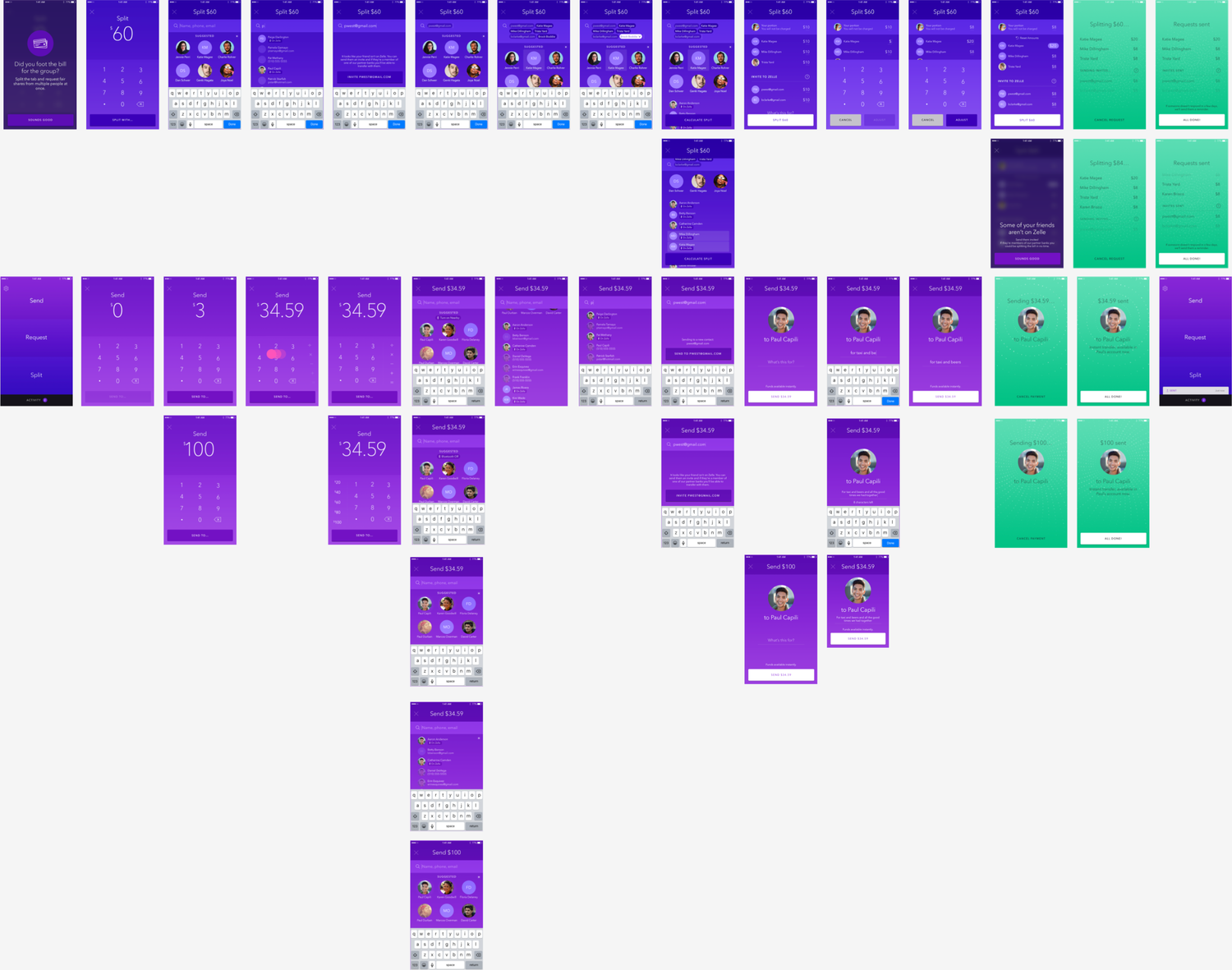

Success screen
Since Zelle operates on the banks’ network, transfers are nearly instantaneous. However, testing revealed that when confirmations appeared too quickly, it often led to user uncertainty about whether the transaction had actually processed.
To address this, we introduced an animation that not only reassured users but also visually referenced both the flow of data and the traditional movement of cash, reinforcing the transaction’s completion.

Iconography
As part of our product process, I also created an icon direction that could feel a bit more branded than the prevailing trends while remaining very clear in function.
UI Kit
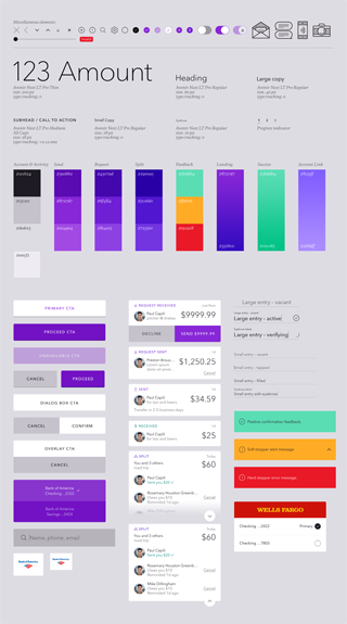
I collected all the UI elements, colors and type styles we had used, letting us iron out inconsistencies and refine our UX and visual systems. It was also a great resource for developers.
Design Pattern
The Zelle design pattern focuses on creating a seamless, secure, and intuitive user experience for digital payments. Here are the key elements of the design pattern:
1. Minimalist Interface
Simplicity: The interface is clean and uncluttered, with a focus on essential functions like sending, receiving, and requesting money.
Minimal Landing Screen: The landing screen is kept simple, reinforcing the core value proposition of fast, secure payments.
2. Trust and Security
Visual Cues: Use of colors, icons, and animations that convey security and reliability, such as the purplish indigo color palette that suggests trust and uniqueness.
Confirmation Delays: A slight pause before transaction confirmations to reassure users that the payment has processed correctly, paired with animations that symbolize data movement and cash transfer.
3. Smart Contact Management
Recent Contacts: Displaying recently paid contacts on the main screen for quick access.
Nearby User Detection: Bluetooth integration to detect nearby Zelle users, even if they’re not in the user’s contact list, facilitating quick one-time payments.
4. Enhanced Bill Splitting
Automatic Calculation: Automatically calculates split amounts for group payments, with the option to adjust individual shares.
Customizable Amounts: Users can tweak individual payment amounts, providing flexibility for uneven splits.
5. Card-Based Activity Feed
Notifications: Notifications and activity history are presented in a card-based format, making it easier for users to scan and interact with recent transactions.
Clarity: Each card provides clear, concise details about the transaction, reducing cognitive load.
6. Integrated Experience
Bank Integration: Zelle is integrated directly into users’ existing banking apps, maintaining consistency with their trusted banking environment.
No Social Features: Focuses solely on the transaction experience, avoiding unnecessary social elements like public feeds or transaction sharing.
These design elements work together to ensure that Zelle provides a user-friendly, efficient, and secure payment experience.

The co-branded product—
Our client is owned by a conglomeration of seven of America’s largest banks who have, of course, already invested heavily in their own digital products. However, they quickly saw the superiority of the experience we created and the obvious question was how it could be integrated into their existing apps. Color was our quickest rebranding tool and we did some studies, like this one for Bank of America, to show how effective it could be. With more time, typography would have been the obvious next step.
zellepay.com—
I also led a separate team through the conceptual design phase of the dot com experience. After introducing the product’s basic facts, we once again focused on the 95% of Americans who were skeptics. Quant research showed that many of these people are aware payment apps exist, but they don’t see how they would make their own lives easier.
Therefore we showed a few common life scenarios where Zelle could really solve a problem. The visual concept was to tie a lifestyle photo to a product screen with animation, a somewhat literal way of showing how the product fits in your life. These were followed by more detailed info on features and security.